

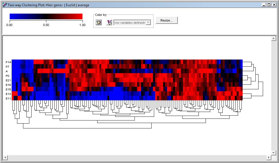
Clustering Plots
CLUSTERING
Clustering is a type of multivariate statistical analysis that is widely used in biology to place biological samples or genes into separate groupings based on their statistical behavior. The main objective is to find similarities between experiments or genes. CodeLinker provides you with a set of tools with which to cluster and explore your data to assist in understanding the relationships that might exist in them.
The clustering techniques include K-Means clustering which generates a specific number of flat (non-hierarchical) clusters. Jarvis-Patrick clustering is a clustering method based on similarity between neighbors determined by using a distance metric. One or more Neighbors in Common are used to judge the cluster membership of the objects under study. Agglomerative hierarchical clustering is a bottom-up clustering method where clusters have sub-clusters, which in turn have sub-clusters, etc. The classic example of this is species taxonomy. The Self-Organizing Map (SOM) is a clustering algorithm that is used to map a multi-dimensional dataset onto a (typically) two-dimensional surface. This surface (a map) is an ordered interpretation of the probability distribution of the available genes/samples of the input dataset.
The distance metrics specify how the distance between data points in the clustering input is measured. CodeLinker gives you a wide choice of metrics to choose from. You can choose from the standard Euclidean (as-the-crow-flies) distance or the Manhattan (city block) distance. Where you want to cluster genes or samples with similar behavior, use the Pearson Correlation Coefficient. If you want to cluster genes that are highly correlated and those that are anti-correlated, use the Squared Pearson Correlation Coefficient. With data that does not show dramatic expression differences in any samples, you may use the Chebychev distance. Use the Euclidean Squared distance in cases where you would use regular Euclidean distance in Jarvis-Patrick or K-Means clustering and, finally, you may use the Spearman Correlation to cluster together genes whose expression profiles have similar shapes or show similar general trends (e.g. increasing expression with time), but whose expression levels may be very different.
To visualize your analyses, there are specialized plots tuned for the algorithms you used to perform the original analysis. Each plot type can be customised and you can export your plot in PNG, SVG, or PDF formats.